Reado

Год
2025
Компания
Reado
Услуга
UX-исследование, UX-аудит, UX/UI-дизайн
Инструменты
Figma
Reado — мобильное приложение, которое помогает находить книги с помощью персональных рекомендаций и сохранять их в личную библиотеку. Я проанализировал основной сценарий нового пользователя, выявил проблемы с удобством на экране рекомендаций и переработал интерфейс, чтобы поиск и сохранение подходящих книг стали понятнее и увлекательнее.
© Reado

Задача
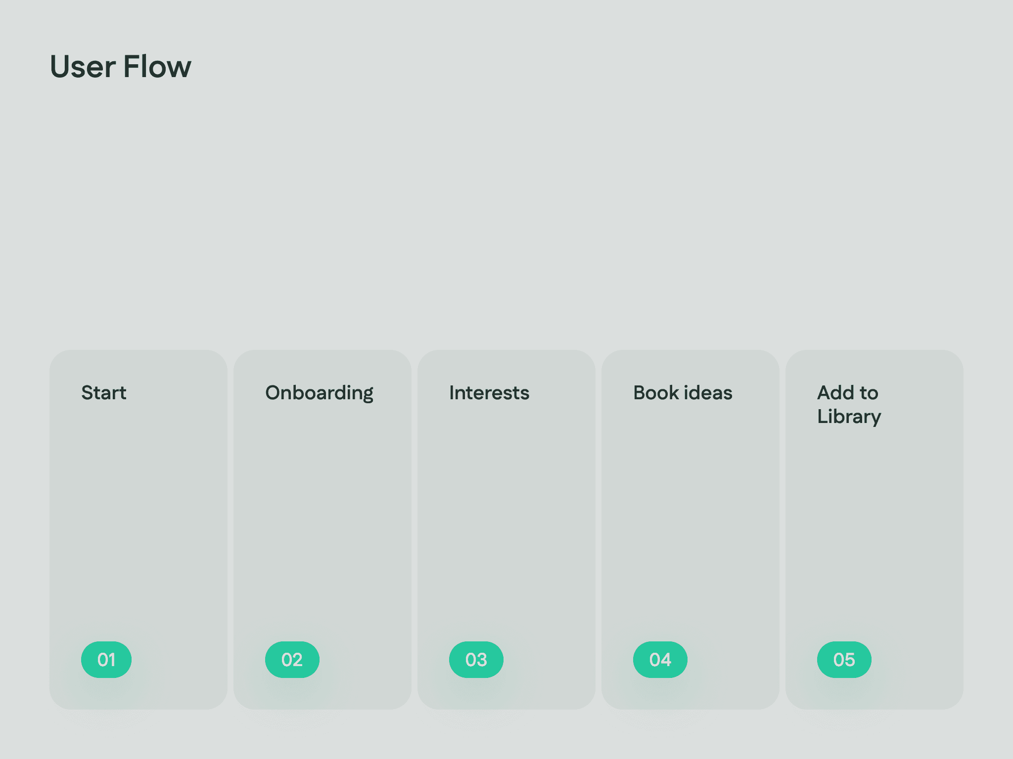
Улучшить путь пользователя от первого запуска приложения до добавления первой книги в библиотеку.
Исходный экран рекомендаций был перегружен конкурирующими блоками, повторяющимися карточками и недостаточными отступами. В рекомендациях не было выраженного визуального центра, поэтому новым пользователям было сложно понять, с чего начать.
Решение
Я проанализировал целевую аудиторию, описал ключевой сценарий от знакомства с приложением до личной библиотеки и перестроил экран вокруг более понятных рекомендаций.
В обновлённом интерфейсе появились выраженная визуальная иерархия, персональные подборки, книга дня, заметный прогресс рекомендаций, фильтры по жанрам и более понятные призывы к действию. Теперь пользователю проще находить подходящие книги, понимать пользу их сохранения и формировать личную библиотеку.
Sonalyt
Coconut Daze